Dopamine Decor: Why Bold Colors Beat Minimalist Neutrals
Bright colors lift mood and energize a home in tangible ways. Beige walls and gray sofas often leave rooms feeling flat. Dopamine decor provides a direct route to more joyful spaces. Apply the approach only when resale or rental constraints do not require strict neutrality.
Core Principles
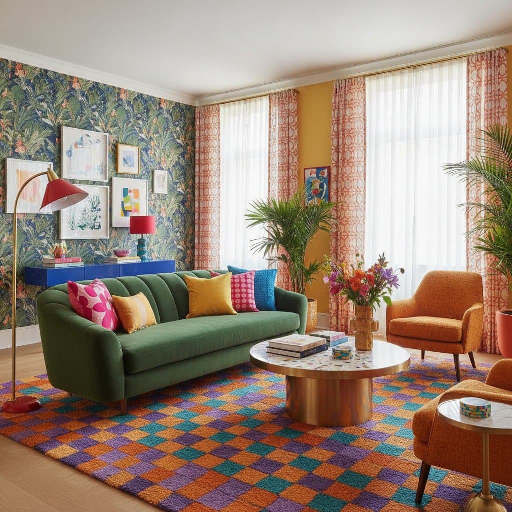
Dopamine decor centers on hues that spark positive feeling. Saturated shades, varied patterns, and rich textures combine to create that effect. Control remains essential. Excessive contrast produces chaos, while balanced layers refresh both the room and the occupant mindset. Test every paint or fabric sample under actual daylight before final selection.
Required Supplies
- Paint samples or peel-and-stick swatches
- Painter tape and a small brush
- Color wheel or digital palette generator
- Throw pillows and accent textiles
- Adjustable lamps for evening evaluation
Begin with existing items. Change pillow covers or hang new artwork before committing to a full repaint.
Implementation Sequence
- Define the target feeling. Decide whether the room should feel calm, energetic, cozy, or inventive. Red and orange tones support activity, blue promotes calm, and yellow encourages optimism.
- Select one dominant color. Restrict bold choices to a single shade in smaller rooms or two shades in larger ones. Keep surrounding neutrals as anchors.
- Evaluate samples in real light. Apply a two-foot test patch or tape swatches to the wall. Watch the color through morning, midday, and evening.
- Introduce texture contrast. Pair matte paint with glossy accessories, plush fabrics, and woven natural materials. This prevents bold color from overwhelming the space.
- Introduce color gradually. Place new art, lampshades, or rugs first. These additions reveal whether the saturation level feels comfortable.
- Follow the 60-30-10 balance. Assign sixty percent of the room to the main color, thirty percent to a secondary tone, and ten percent to accents. The ratio maintains order amid vibrancy.
- Refine for visual rest. Step back and remove one element if the arrangement feels crowded. The eye needs at least one neutral area.
- Adjust lighting temperature. Warm bulbs soften intense hues, while cooler bulbs increase contrast. Set lighting before any permanent paint application.
- Incorporate meaningful objects. Display items that carry personal history. Color resonates most when it connects to memory.
Recommended Practices
- Apply bold color in shared areas such as kitchens and living rooms.
- Pair prints that share at least one hue family.
- Reserve one wall as a neutral pause.
- Repeat any accent color in three distinct locations to create rhythm.
Practices to Avoid
- Combine multiple saturated colors without sufficient neutral contrast.
- Overlook paint undertones that produce clashes.
- Apply color to unsealed wood without primer.
- Disregard how lighting alters perceived warmth.
Professional Assistance
Engage a color consultant when multiple rooms require coordination or when complex tones must match across surfaces. Specialists assess light direction, finish durability, and pigment stability, which reduces material waste.
Budget and Timeline
Sample costs begin at a few dollars. Full updates that include paint, textiles, and lighting typically range from several hundred dollars. A single room usually requires one weekend for testing and application.
Ongoing Care
- Dust vivid surfaces each week.
- Touch up marks twice annually.
- Rotate textiles with the seasons.
- Review the palette after major life events.
Daily Color Integration
Once bold hues enter the home, neutral rooms lose appeal. Begin with small changes, observe results, and expand only when comfort increases. Thoughtful color placement turns routine spaces into sources of daily energy.